

Version 19.0 of Process360 Live, iGrafx’s SaaS Process Intelligence platform, is going to start rolling out to customers starting on May 22nd.
This release of Process360 Live focuses on two key priorities: making it easier to do things and empowering you to do more things.
Making it Easier to Do Things
This is our first major refresh of the look and feel of Process360 Live as part of our ongoing commitment to delivering the best user experience possible, mentioned in our UX Manifesto.
We’ve followed Material Design Standards (the same that Google use), to bring a modernized, user-focused experience that just…feels right.
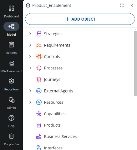
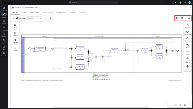
The new experience starts with an update to all of our existing icons that represent various parts of your organization (Strategy, Business, Data, Compliance, and Resources) as well as various parts of the Process360 Live platform (folders, charts, tables, etc.).
These icons reduce the brainpower needed to figure out what something is and have been color coded to find what you need faster.
![]()
You’ll also find a permanent navigation rail on the left side of the screen – after all – isn’t trying to find out where you are the first thing you look for when viewing a map?
Next up, improvements to the #1 most common user activity – Diagramming
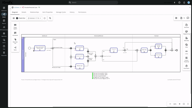
The first thing you’ll notice when diagramming is that there’s a lot more space so it’s easier to create and view your diagrams without having to scroll around. The new diagramming space was built with presentation in mind. Diagrams now automatically default to a single page layout to match the modern era that we live in. But don’t worry, even if you aren’t trying to save a tree, you can still go back to the old page view for your printouts.
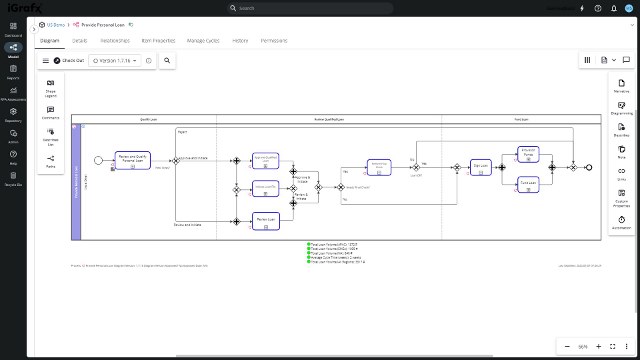
How’d we free up so much screen real estate you might ask? By carefully categorizing and drastically simplifying the hundreds of ways that you can customize and contextualize your diagrams. This started with removing the everything-everywhere-all-at-once top menu bar.
In its place, we’ve added two sidebars, a view bar, and an auxiliary bar. Let’s look at them one by one, starting with the sidebars.
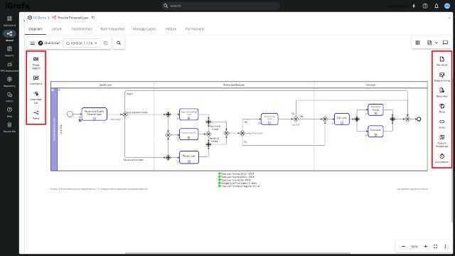
The new sidebars are where most of the diagramming functions went. The menus are cleaner, and the options are better categorized. Even better, they are fully customizable, so you can customize which options you want to see based on what you use.
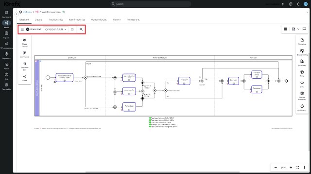
Next up, the view bar.
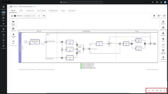
The view bar is placed in the bottom right, where you’d expect it. It’s your one-stop shop for zooming, resizing, and toggling full-screen mode.
Then we have our auxiliary toolbar.
The auxiliary toolbar houses narrative and apps options. For narratives, you have various options including the process narrative, Standard Operating Procedure (SOP), or another narrative of your choice.
The apps are the things you can “do” with your diagrams, including comparing diagram versions or running a simulation.
Lastly, we’ve added the most essential options in the top left, including checking diagrams in or out, undoing or redoing actions, adding text or lines, using the format painter, or searching the diagram.
Overall, we think you’ll appreciate the extra space and it will be easier to find the options you’re looking for, but if you can’t find something, check out the detailed documentation on the new diagram experience here.
Altogether these changes should make the need to scroll less common — we’ve seen some complex diagrams. So even if you still need to scroll, we’ve made that easier too. Left clicks now automatically act as a lasso select, whereas right clicks scroll, matching your experience with most other software. Additionally for our laptop users, the touchpad fidelity has improved so moving around the diagram should be smooth as butter. Oh, and we added pinch to zoom too.
To round out our list of “making it easier to do things”, we’ve added a cool new auto-assignment feature to your diagramming experience.
When creating a process diagram, you often put process steps into different swimlanes. Sometimes the lanes represent the responsible person or team, sometimes they represent the systems through which the tasks are executed.
This important context is now automatically added to your business model as you create your diagrams. You don’t have to manually assign a team as “responsible” for a given process step, this happens automatically as you move shapes around in swimlanes.
Check out the full documentation for this assignment here.
Empowering you to do more things
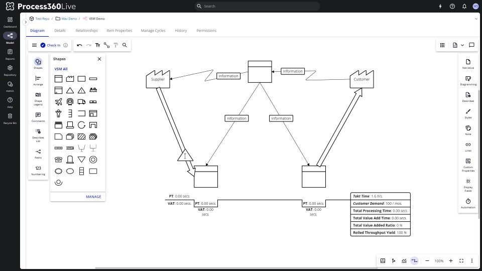
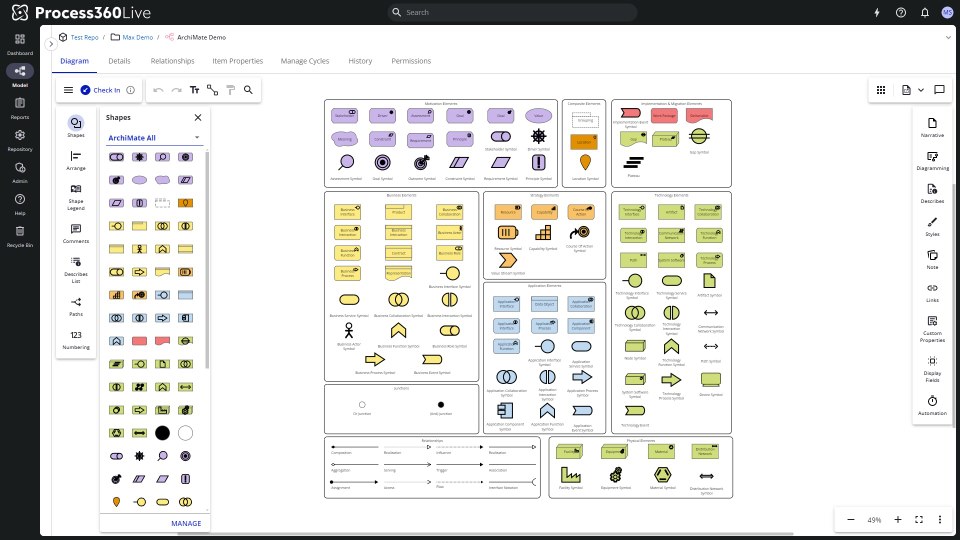
Although many organizations use Process360 Live for their process modeling needs (i.e., BPMN) or customer journey maps, we’d like to announce that two more types of diagrams are being added to our catalog of diagram templates: Value Stream Maps and ArchiMate.
Value Stream Maps (VSM) are typically higher-level diagrams used to reduce waste within a business. You can now find a shape library for VSM in the diagramming section.
ArchiMate is a library used primarily by Enterprise Architects to describe, analyze, and visualize their various business domains.
Check out the full documentation for Value Stream Maps here.
We didn’t forget about BPMN either. We’ve released a new Visio import tool that uses some magic behind the scenes to import diagrams your team has already created in Visio and convert them to the BPMN standard in iGrafx. You can read more about it here.
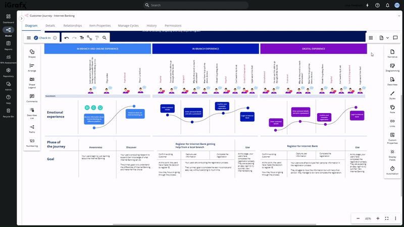
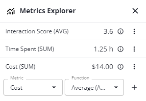
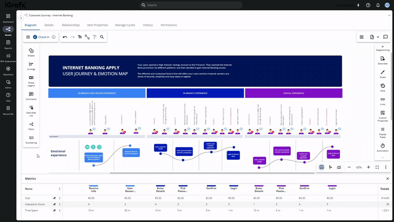
What about our last major diagram type, Customer Journey maps? While this next feature works for all of our diagram templates, we’ve seen many customers leveraging it for customer journeys while it was Early Access. That feature is Process Metrics.
As the name suggests, we’re allowing users to add metric data to each step in a diagrammed process or customer journey flow. Things like duration, interaction score, and other data that would be used to assess health.
This feature is made even more powerful by two new features – Custom Properties and Paths.
While we provide out-of-the-box properties for our diagrams based on the most common that our customers have asked for, we understand that each business is unique. Custom properties allow you to truly customize diagrams to meet your exact needs. These could be new fields to describe an object, or even new relationships between objects.
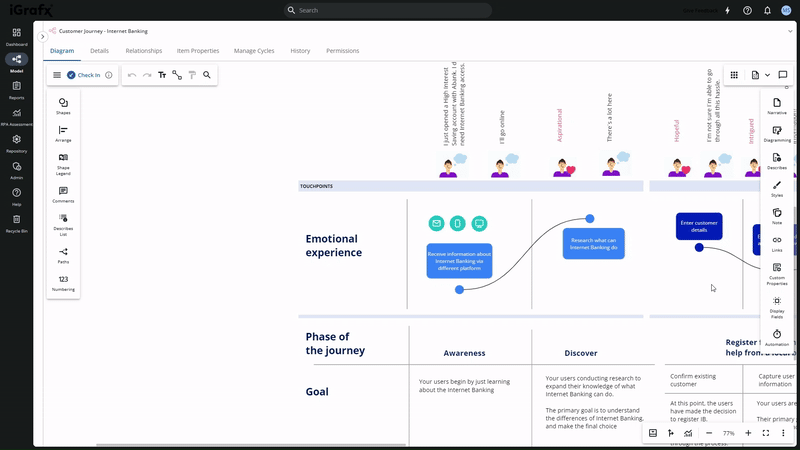
On the other hand, paths allow you to visualize specific flows through a process or customer journey, which is particularly useful if you want to analyze or compare different things like an in-store vs an online experience.
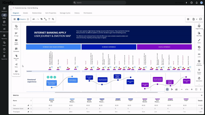
By setting thresholds for different metrics, you can create a heat map on a diagram to show exactly where things are flowing smoothly vs. where bottlenecks are popping up or customers are having a bad experience. Combining this with being able to look at the different paths a process or customer takes, and you have some high-octane analysis on your hands.
You can read more about Process Metrics here.
Other New Additions
While making it easier to do things and empowering you to do more things were our areas of focus, we did have some other notable additions with this release.
The first is we’ve added is anti-virus scanning. Whenever you upload a file, it will be screened for safety before it is added to your repository. It is then screened again on download, because new viruses may have been cataloged in between.
Read more about it here.
And the last feature that we’re highlighting in the release is a new enhanced audit service made available by our REST API. You can granularly track which parts of the platform are being used, and by whom, to build new usage dashboards and more effectively create training programs.
More information on the audit service can be found here.
Conclusion
Version 19 of Process360 Live is packed with new features, including a bunch of quality-of-life improvements we didn’t have space to cover today. You’ll immediately start benefitting from a refreshed look and feel, more intuitive diagramming experience, new diagramming libraries, and exploration of process metrics.
I’d like to give a huge shoutout to all of our amazing customers who work with us, giving us the feedback we need to make Process360 Live the perfect process intelligence platform for your organization.